Most marketing dashboards are built to impress marketers… not to inform clients. They’re packed with metrics, acronyms, and charts that make perfect sense to you — but leave clients nodding politely while secretly wondering what any of it means.
A great dashboard doesn’t just display data. It tells a clear story: What happened, why it matters, and what happens next.
Here’s how to build one clients actually understand — and trust.
1. Start With Client Questions, Not Metrics
Before you open any analytics tool, ask yourself what your client actually wants to know. Almost every client’s concerns fall into a few core questions:
Are we getting results?
Is the investment worth it?
What’s working best?
What should we change next?
If a metric doesn’t help answer one of those questions, it doesn’t belong on the main dashboard.
Pro move: Write the client’s top 3 questions at the top of your planning document. Every chart must answer one of them.
2. Lead With Outcomes, Not Activity
Clients care far more about business impact than marketing activity.
Instead of leading with:
Impressions
Clicks
Reach
Lead with:
Leads generated
Sales or revenue influenced
Cost per acquisition
Activity metrics can still appear — but only as supporting evidence.
Think of it like this:
👉 Activity explains performance
👉 Outcomes prove value
3. Use Plain Language (Seriously Plain)
Marketing terminology is second nature to you — but it’s a foreign language to many clients.
Replace jargon with everyday language:
| Instead of | Say |
|---|---|
| CTR | “Percentage of people who clicked” |
| Conversion Rate | “Visitors who became customers” |
| Engagement | “People who interacted with content” |
| Funnel Drop-Off | “Where people stop in the process” |
If a metric requires explanation every month, rename it permanently.
A simple label like “Cost to get one customer” beats “CPA” every time.
4. Limit the Dashboard to 5–8 Key Metrics
More data does not equal more clarity. In fact, too many numbers make clients trust the report less.
A strong client-facing dashboard typically includes:
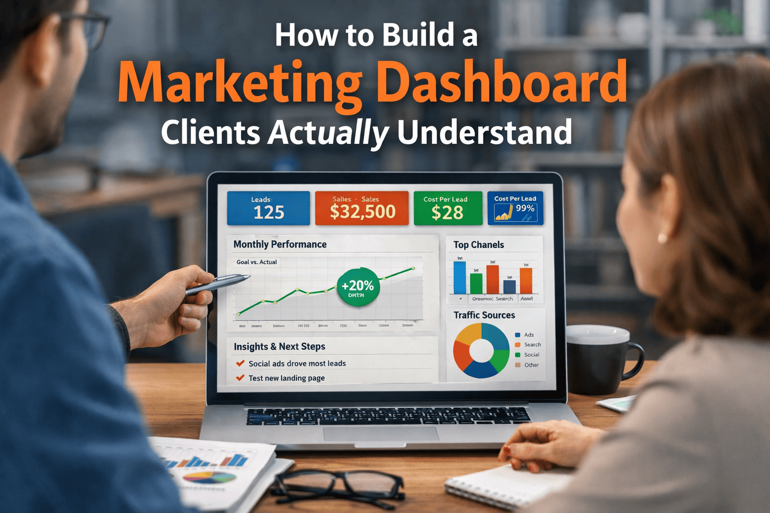
Performance Summary
Leads / Sales
Cost per Lead or Acquisition
Revenue or Pipeline Value
Channel Performance
Top-performing channel
Budget vs results
Trend Indicators
Month-over-month change
Goal progress
Everything else can live in a secondary “deep dive” tab.
If clients feel overwhelmed, they stop paying attention — and that’s when dashboards stop working.
5. Use Visual Hierarchy to Guide Attention
Clients scan dashboards — they don’t study them.
Structure matters more than design style.
Recommended layout:
1️⃣ Big headline result (the “so what”)
2️⃣ Supporting metrics
3️⃣ Channel breakdown
4️⃣ Trends over time
5️⃣ Insights and next steps
Use:
Large numbers for key outcomes
Simple charts (bar, line, donut)
Color sparingly to highlight change
Avoid:
Pie charts with 8 slices
Dense tables
Technical filters
Complicated comparisons
If someone can’t understand a chart in 5 seconds, simplify it.
6. Add Context Directly Into the Dashboard
Data without explanation invites misinterpretation.
Always include short notes like:
“Increase driven by seasonal demand”
“Lower CPL due to new targeting”
“Traffic down, conversion rate up”
This transforms a dashboard from a data dump into a guided narrative.
Many teams use tools like Google Analytics, Looker Studio, or HubSpot to build dashboards — but clarity comes from commentary, not software.
7. Show Progress Toward Goals
Clients think in terms of targets, not isolated numbers.
Always include:
Monthly goal vs actual
Percentage of target achieved
Trend direction (up, down, stable)
Even a simple progress bar dramatically improves understanding.
When clients see movement toward a goal, the dashboard feels meaningful — not just informative.
8. Make Insights a Standard Section
Every dashboard should answer:
👉 What does this mean?
👉 What should we do next?
Add a short “Insights & Actions” section each month. Example:
Insights
Paid social generated the lowest cost per lead
Organic traffic decreased but quality improved
Next Steps
Increase budget for top-performing campaign
Test new landing page for organic traffic
This is where you demonstrate strategic value — not just reporting ability.
9. Customize by Channel Only If Relevant
Clients don’t need equal detail for every platform.
Include breakdowns only where they matter most. For example:
Paid campaigns from Meta Ads or TikTok Ads if advertising is a major investment
SEO trends if organic search is a key driver
Email metrics if nurturing is central to conversion
Relevance builds trust. Excess detail creates noise.
10. Test Your Dashboard on a Non-Marketer
This is the fastest quality check you can run.
Show the dashboard to someone outside marketing and ask:
What happened this month?
Is performance good or bad?
What would you do next?
If they can answer confidently, you’ve succeeded.
If they hesitate, simplify again.
What Clients Really Want From Reporting
Clients don’t want more data.
They want clarity, confidence, and direction.
A dashboard that works should make them feel:
✔ Informed
✔ Reassured
✔ Oriented toward action
When your dashboard tells a simple, meaningful story, reporting stops being a chore — and becomes proof of value.