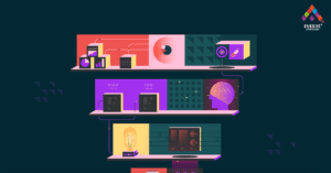
The Perfect User Experience for your Web Application: Light-on-Dark Color Scheme?
The light-on-dark color scheme, also known as Dark Mode, is the new, cool kid in the web application industry. There’s a lot of buzz going on around the topic, chances are high that if you are an owner looking to get a web application for your business, someone has already tried selling the idea of dark UIs to you.
What’s with the Noise around the Light-on-Dark Color Scheme?
Light-on-dark color schemes are User Interactions consisting of light text and app components all on a dark background. It’s now so popular for several reasons. First is the hype major social media apps have given Dark UIs by adding the feature as an option or totally migrating to awesome looking Dark Modes. Another reason is that犀利士
when done right, it gives a feeling of elegance and mystery to web apps, catching and sustaining the attention of users who are already familiar with seeing dark text on light backgrounds everywhere. Retaining user attention is something you’d want for your web application and this is why the NetFlix app looks like that.
The dark mode is also handy for eliciting strong emotions from users, again using the NetFlix app as an example, the many red buttons on black background in the app’s UI has been shown to increase user excitement and expectations.
It has also been shown that looking at light backgrounds gives eye fatigue faster than dark backgrounds. Check out Is Dark Mode Better for Your Eyes? – Rx Optical
Another interesting advantage is that charts and other graphics are much easier to focus on a light-on-dark color schemed UI.
When to Use Dark UIs

Unfortunately, light-on-dark color schemes are not for every kind of web app. Web applications intended to display lots of text content or that will require many dropdowns are not so nice with dark UIs. That is, if there is a need to display lots of textual information to users, then a light-on-dark color scheme is not the best. This is because reading text content for long on dark backgrounds is hard for most users and it will hurt your user experience.
But if the web app doesn’t display too much textual information then the dark mode is a great option.
No worries though, if you still want in on the dark UI magic but your web app needs to display lots of textual information then a UI design that has both dark-on-light and light-on-dark color schemes can be used, not just a dark mode feature now but an actual mix of both at the same time.
The best way to go about this is to make analytics pages and other pages displaying lots of graphics with light-on-dark color schemes and to allow main windows with more text content to have dark-on-light UI. With eye health advantages for your users, elegance, coolness, and power to control user experience by eliciting emotions. The dark mode is every bit worthy of the noise surrounding it.
So, over to the dark side?
How do I Implement Light-on-Dark Color Schemes on my Web App?

The most efficient way if you’re a business owner is to hire a UI/UX designer. You can hire a dedicated one ready to work remotely at Fuerte Developers
If you’re a designer yourself, then here are some tips to make your Dark UI designs awesome.
- Use Visuals. Less Text: We’ve discussed the reason for this earlier, under When To Use Dark UIs
- High Component Contrast: Use colors that contrast sharply with the dark background for text and other components.
Here components are made with contacting colors to aid visibility. From Dribble
- KISS: Keep It Simple Stupid. Always, always, simple is better for a light-on-dark scheme. Too much information and design complexity is bad for dark mode and will subtract from the user experience.
- Research: Your guide to making light-on-dark color schemes should not end here. Research with other resources. Here’s a helpful article: Dark UIs. The Good and the Bad. Dos and Don’ts. | Toptal
- Get Inspired: Designing inspiration usually gives better results. Find some Inspiration for dark themed designs on Dribble.
Written by- Miracle Ufodiama


